
Exit-Intent Surveys: Ask Why Visitors Leave, Then Answer the Reason
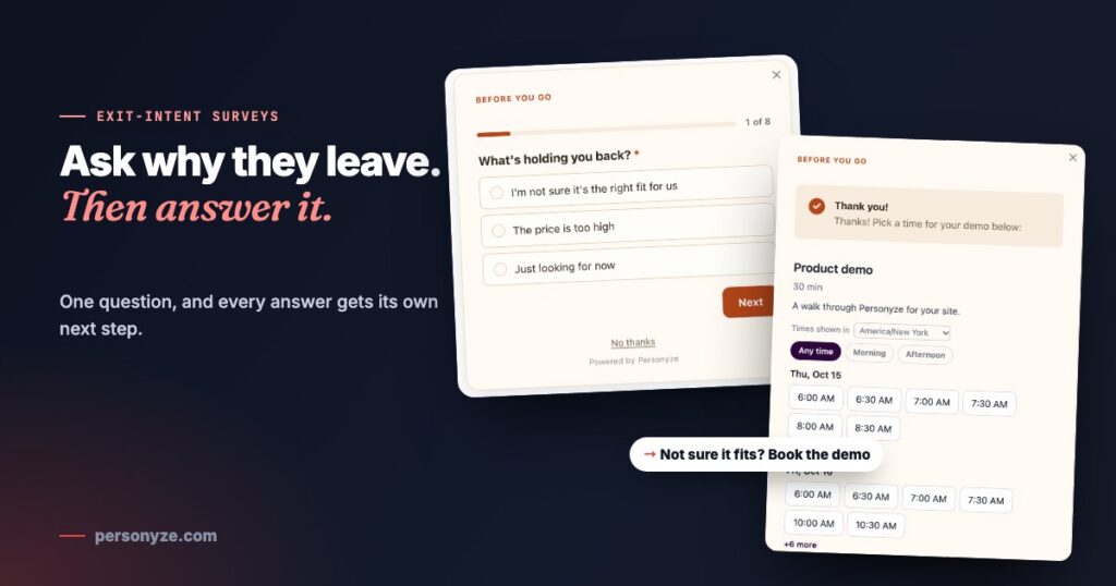
The usual exit popup makes everyone the same offer: ten percent off, before you go. It is the answer to one reason for leaving, handed to people who are leaving for all of them. Someone unsure whether the product fits their team does not need a discount. Someone put off by the delivery cost does not need a demo. And someone who was only looking has just learned that waiting gets them a better price.
An exit-intent survey asks first. One question, one tap: what is holding you back? The answer decides what happens next — on the spot, and the next time that visitor comes back.
The survey on our own pricing page
New visitors who are about to leave the plans page on personyze.com get one question. Each of the three answers leads somewhere different, and each follow-up is asked only of the people it is for.
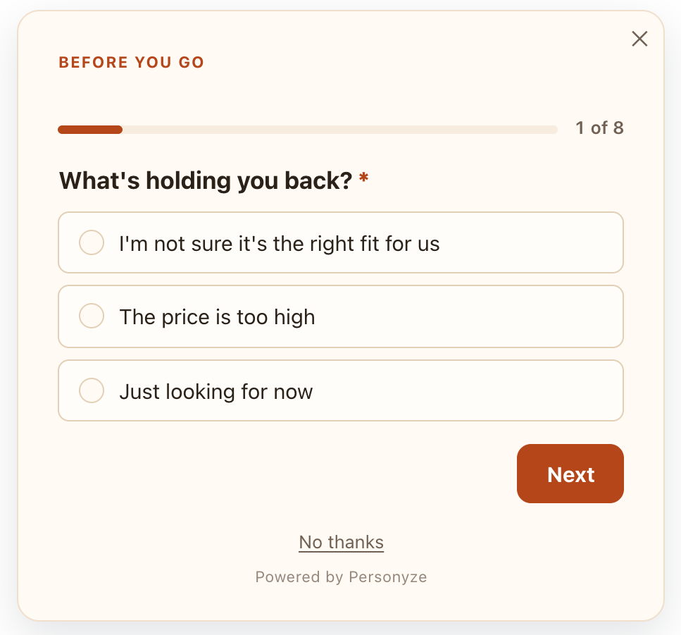
I’m not sure it’s the right fit for us
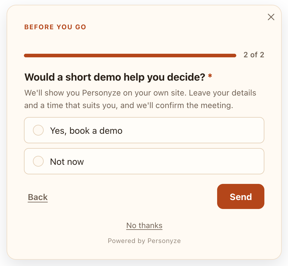
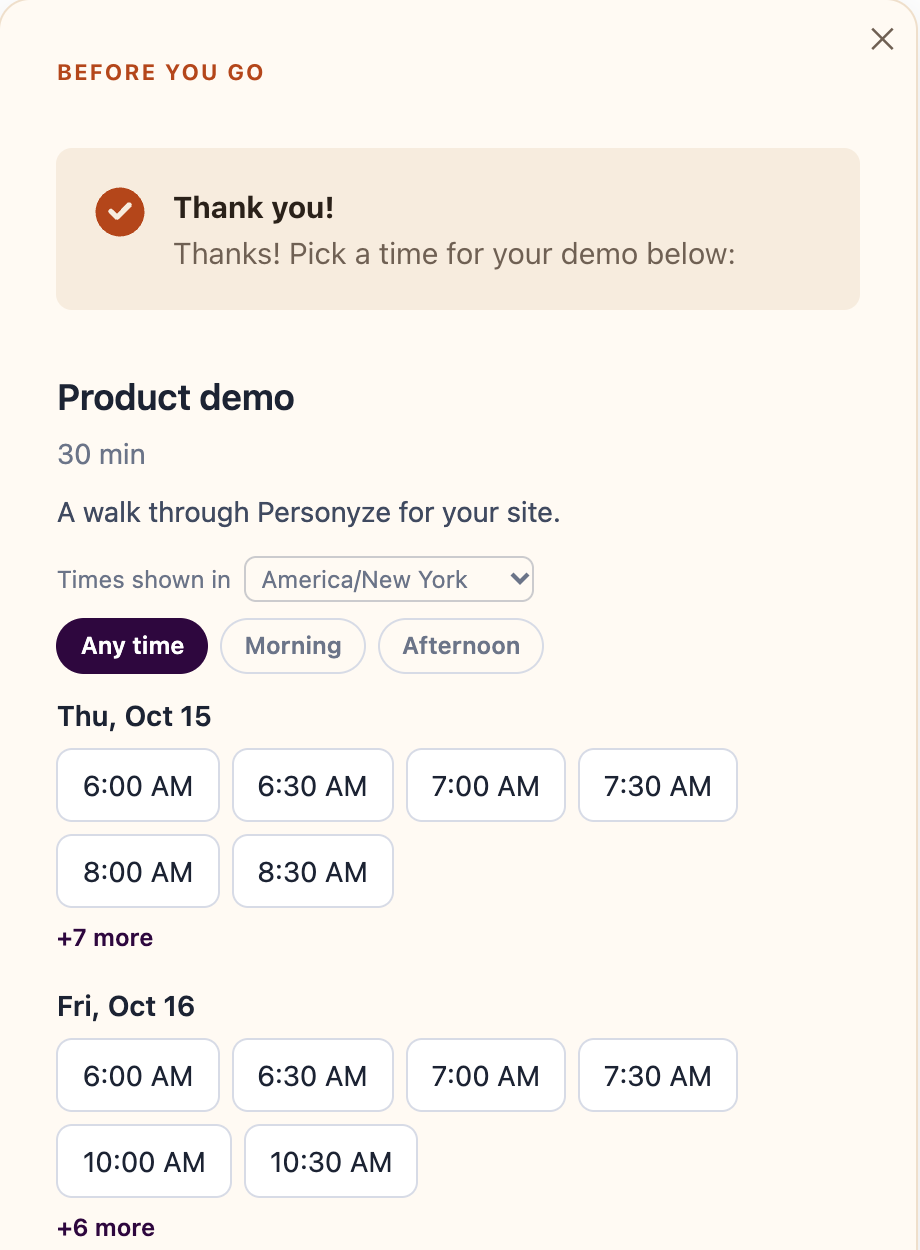
Doubt about fit is a question only a conversation answers, so this path offers one. A visitor who says yes to a short demo leaves a work email, a name and a company, and the last screen of the survey is the booking calendar itself, with the real free times of the person who runs the demo. The visitor picks a slot without leaving the page.
The price is too high
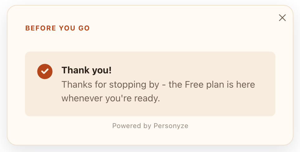
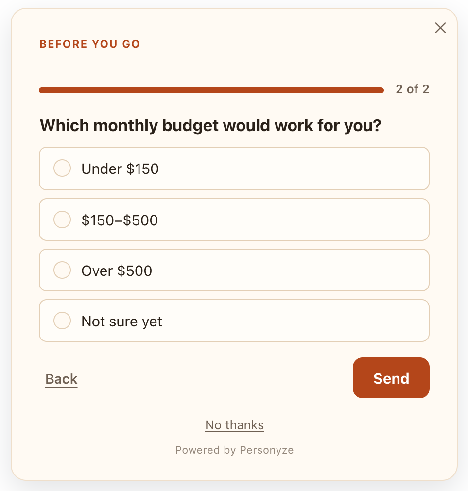
“Too expensive” means different things at different budgets, so the survey asks which budget would work. A small or unsure budget gets a thank-you with a code to try any paid plan free for two weeks. A larger one is offered a free two-week proof of concept, set up with our team, and only then asked for contact details.
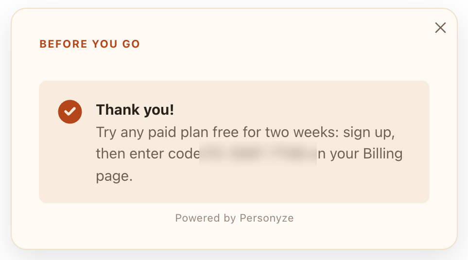
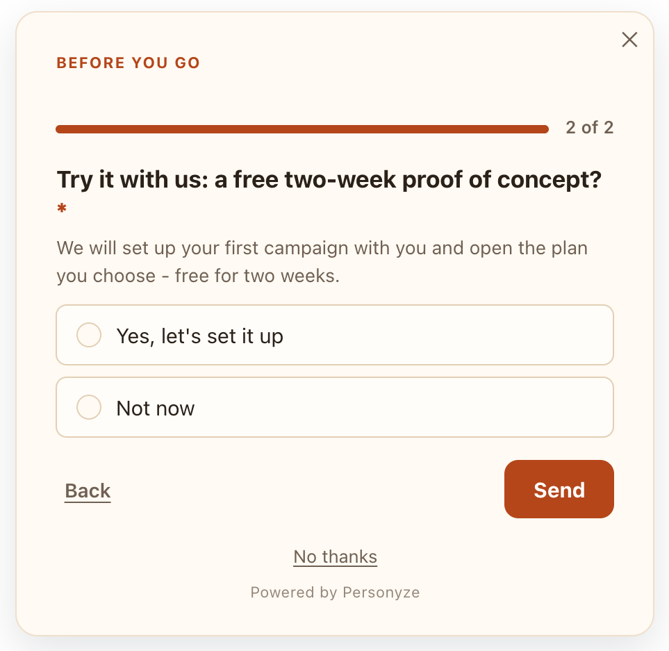
Every path ends on a screen written for that answer. The full interactive version of this pattern, for a fictional training company, is in our examples library: an exit survey on the pricing page.
The rules behind it
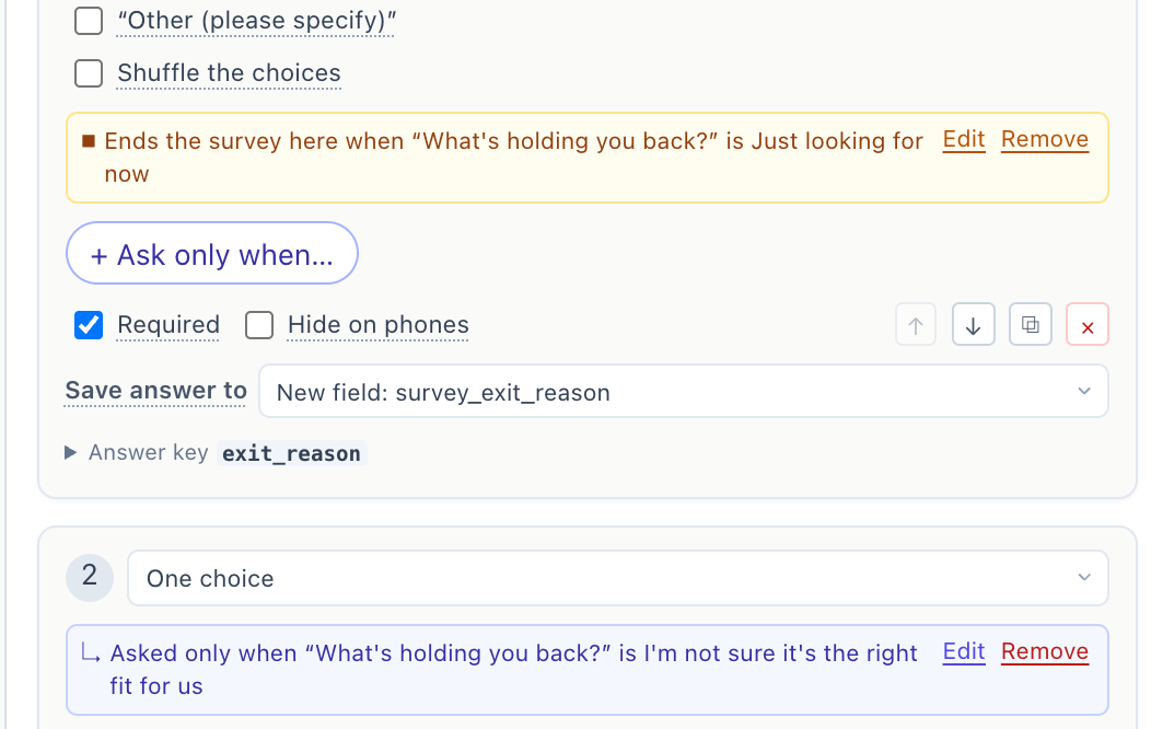
None of this needs code. The survey is one Personyze action, and each piece is a setting:
- When it opens. On exit intent: Desktop — cursor leaves fires when the pointer heads for the address bar or the close button; Mobile — Back tap catches the Back button once per page view, and only after the visitor has engaged.
- Who is asked. Ours asks new visitors on the plans page, in eight languages. A survey is targeted like any campaign — by page, source, behaviour or anything else the profile knows.
- What comes next. Each follow-up is set to Ask only when… an earlier answer calls for it, and End the survey here when… gives an answer its own last screen and thank-you line.
- A booking on the spot. Then show a booking calendar puts your meetings calendar on the thank-you screen, and can fill in the name and email the visitor already gave.
- A page that fits the answer. Then show a button adds a button under the thank-you line: the plan, the guide, the offer.
- The answer stays. Save answer to keeps it as a field on the visitor’s profile, so the next visit’s campaigns can target it.
- The team hears about it. Answers go where your form submissions go — email, Slack, HubSpot, a webhook or Zapier — and a destination can be set to Only when a given answer comes in, such as “Yes, let’s set it up”.
The coupon goes only to the people who asked for one
A coupon is the right reply to exactly one answer, so it should reach exactly the people who gave it. Save the answer to the profile, and an AI promotion can name that field in Who sees it — the coupon then appears for visitors who said the price, wherever your promotions show and on their next visit, and for nobody else. Visitors who were unsure about fit get the demo; visitors who were just looking get nothing that teaches them to wait for a discount.
Because the reply is its own campaign, it can be tested like one: an A/B test per audience with a holdout tells you whether the coupon wins sales or only gives away margin on sales you would have made anyway.
A playbook: the reasons people give, and the reply that fits
The first question changes with the site; the pattern does not. Three or four answers people actually give, one reply in the survey, and one follow-up for the next visit.
| They answer | Reply in the survey | And on the next visit |
|---|---|---|
| Online store · cart or product page | ||
| Delivery costs too much | A thank-you line with the free-delivery threshold | A delivery coupon, only for this answer |
| Not sure about size or fit | A button to the size guide | Reviews moved up the product page |
| Want to compare first | A button to the returns policy | The products they viewed, back in front of them |
| Just browsing | Ends here | Nothing — no discount for leaving |
| Software · pricing page | ||
| Not sure it fits our team | A demo, booked on the thank-you screen | Case studies from their industry |
| The price | A budget question, then the plan or trial that matches | A trial or coupon for this answer only |
| Need to check with my team | A button to a one-page summary they can forward | The summary in the hero when they return |
| A feature is missing | “Which one?” — sent to the product team | The page about that feature, if it exists |
| Services and lead generation · quote form | ||
| Not ready yet | A checklist or guide to download | The guide, not the form, on the next visit |
| Unsure what it will cost | A button to the price ranges | A calculator in place of the long form |
| Would rather talk to someone | A booking calendar | Their booking, not a sales pitch |
For a reader who will not subscribe, the same shape works: “too many subscriptions” is answered with a lighter plan, “only here for this article” with the newsletter.
Five rules that keep it from annoying people
- One tap first. Three or four answers, the most common first, and no typing on the first screen.
- “Just looking” is always there, and it ends the survey. Forcing an explanation out of a browser costs more goodwill than the answer is worth.
- Ask once. Once per visitor, never to someone who already answered, and never on the payment step itself.
- Make every answer worth giving. If no reply exists for an answer, drop the answer.
- Watch where people stop. The report shows the question visitors quit on. Cut it, or move it after the yes — ours asks for contact details only once someone has accepted the demo or the trial.
Reading the answers
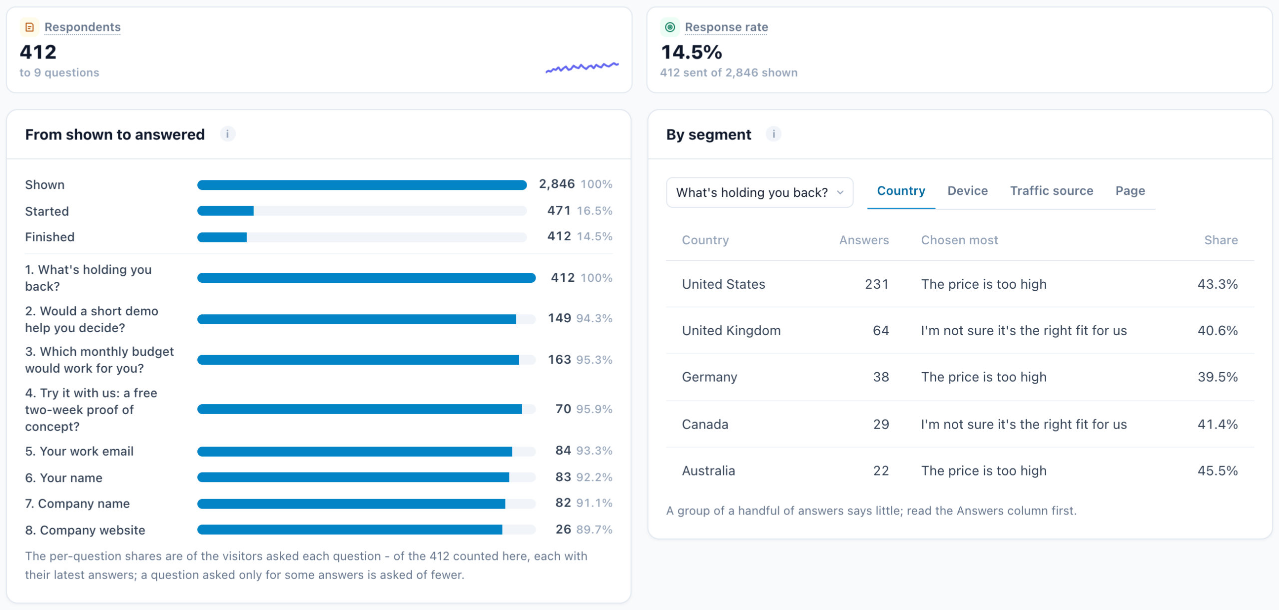
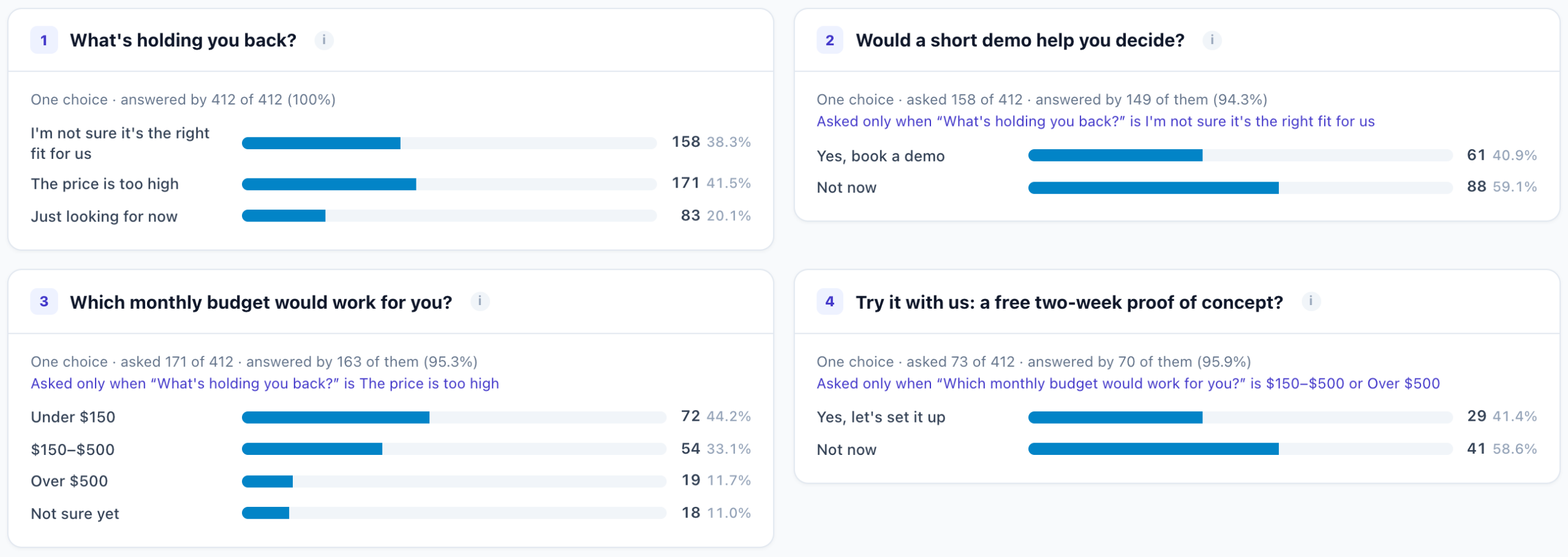
Each survey has its own report: shown, started and finished; every question with the share of each answer; the answers by country, device, traffic source and page; where visitors stop; the latest written answers with a summary of them; and a CSV of everything. Read the counts before the percentages — a handful of answers says little — and let the report decide which replies to build next.
For the bigger picture — post-purchase and reader surveys, and publishing the totals on your site — see on-site surveys that change the next page, and the two other surveys we run in three surveys on our own site.
Questions people ask
What is an exit-intent survey?
A short survey that opens when a visitor looks about to leave — the cursor heading for the address bar on a desktop, the Back button on a phone — and asks why they are going.
What should an exit survey ask?
One question with three or four answers people actually give, such as “What’s holding you back?”, plus “just looking”. Ask a follow-up only for the answers that need one.
Does exit intent work on phones?
Yes, differently. A phone has no cursor, so Personyze catches the Back tap instead: once per page view, and only after the visitor has engaged with the page.
Should an exit survey offer a discount?
Only to the visitors whose answer calls for one. Save the answer to the profile and target the coupon at it; everyone else gets the reply that fits their reason.
Can the answer change what the visitor sees later?
Yes. A question can save its answer to a field on the visitor’s profile, and any campaign or promotion can target that field on the next visit.
Can a survey book a meeting?
Yes. The thank-you screen can show your meetings calendar with its real free times, and can fill in the name and email from the survey, so the visitor books before leaving.
Book a demo with a personalization expert
30 minutes with a personalization expert. Bring your stack, your goals, your skepticism. We'll show you what changes when every visit feels like the only one.