
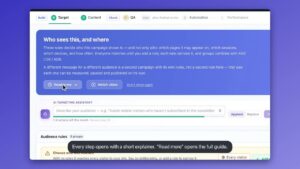
Inspire me · What a plan looks like
Northwind Analytics
what each visitor should see.
B2B SaaS (account intelligence for revenue teams): a single demo-led home page with no store or catalog · goal: More leads and demos
The ideas, drawn on Northwind Analytics
1Show logos and the customer quote that match the visitor's industry
Customer Logos and case studiesCompany data (industry and size of the visiting company)- Who
- Visitors recognised as logistics, health or other industries, and by company size
- Where
- The 'Trusted by revenue teams at' strip under the hero (y≈750 on desktop) and the customer quote block at y≈4111
- Why
- The strip shows ARCADIA, KESTREL, LUMEN, MERIDIAN and VERTEX to everyone, while the mock-ups lead with Halden Systems (logistics) and Bluepeak Health. A visitor sees proof from their own sector instead of a general list.
- Measure
- Demo button clicks and demo requests from visitors who saw a matched strip versus the default strip, split by industry


2Rewrite the hero line for the visitor's role and search term
Text and image personalizationAd & search (campaign or keyword) and Company data- Who
- Visitors from paid or search terms about intent data or account scoring, and marketing versus revenue visitors
- Where
- The H1 and subhead 'Northwind reads the signals… which twenty accounts to work this week' at the top of the first screen
- Why
- Every visitor gets 'tells your revenue team', but the 'Prove which programs moved pipeline' pitch for marketers sits at y≈3219. Marketing-source visitors can see that angle in the first screen.
- Measure
- Hero 'Book a demo' click-through and scroll depth by source and role


3Put a calendar in the demo path for high-intent visitors
Book a meetingVisit history (returning, no demo yet), Viewed before (pricing or resources), Company data (target size)- Who
- Returning visitors, visitors who read pricing or articles, and larger companies
- Where
- Replace the hero 'Book a demo →' and the closing 'See your own accounts, ranked' block (y≈6301) with an inline calendar
- Why
- The page has no form (forms: []) and 'Book a demo' is a plain button, with the thirty-minute offer only near the bottom. A visitor who is ready can pick a slot without leaving the page.
- Measure
- Meetings booked per 100 visitors and 'Book a demo' clicks that end in a booked slot


4Turn the top bar into a demo nudge for returning visitors
Banners, bars and pop-upsVisit history and Goal reached (visited before, no demo booked), Device- Who
- Returning visitors who have not booked, on desktop and phone
- Where
- The top announcement bar above the nav: 'New: intent signals… read the release notes'
- Why
- The bar sends visitors to release notes on both the desktop and phone first screens. For people who already know the product, a line like 'See your own accounts, ranked in 30 minutes' links to the demo path.
- Measure
- Clicks on the bar, with release-notes clicks versus demo clicks, and demo requests from returning visitors
5Fill 'Recommended reading' with the article that fits the role
Content recommendationsViewed before (articles read) and What they tell us (role)- Who
- Marketing visitors, revenue visitors and first-time readers who are not ready to book
- Where
- The 'Recommended reading' block at y≈6009, which currently says 'Empty on purpose', and the top of the Resources list at y≈4845
- Why
- The block is an unfilled placeholder. The six cards are the same for everyone: marketers could get 'Personalizing the Pricing Page' and 'Account-Based Content That Actually Lands', and sellers 'Nine Signals Worth Acting On' and 'From MQL to Moment'.
- Measure
- Clicks on recommended cards, and demo requests from visitors who clicked one
6Offer the State of B2B Personalization report in exchange for a work email
Lead capture formsVisit history (first visit, scrolled the proof, no demo click)- Who
- First-time visitors on desktop who are about to leave without clicking 'Book a demo'
- Where
- An exit-intent pop-up or slide-in after the proof section (stats at y≈3738 and customers at y≈4111)
- Why
- The only demo-less route is the footer 'Work email / Subscribe', while 'The 2026 State of B2B Personalization' is listed in Resources without a signup. A softer offer captures leads who are not ready for thirty minutes.
- Measure
- Form submissions per 100 exiting visitors, and how many of those leads later book a demo
Findings
- The hero (H1 'See which accounts are actually in market.' and the line about 'your revenue team') is the same for every visitor, even though the page later splits into 'For revenue teams' (y≈2678) and 'For marketing' (y≈3219, 'Prove which programs moved pipeline'). A marketing visitor has to scroll about 3,000px to see their own pitch.
- The 'Trusted by revenue teams at' strip on the first screen (ARCADIA, KESTREL, LUMEN, MERIDIAN, VERTEX) is the same five logos for everyone. Nothing says which of them is in the visitor's industry.
- The only conversion path is 'Book a demo' (nav, hero, final block). The page has no form (forms: []), and the only email field is the footer 'Work email / Subscribe'. A visitor who is not ready for a 30-minute call has nowhere to go.
- The closing 'See your own accounts, ranked' block (y≈6301 of a 7,163px page; 'Thirty minutes, your data') is the main ask after the proof, so a visitor has to scroll nearly to the end to meet it.
- The top announcement bar ('New: intent signals from your own product telemetry — read the release notes') sits above the nav on desktop and phone. Its only link goes to release notes, not to the demo.
- The 'Recommended reading' block (y≈6009) literally reads 'Empty on purpose. This is where a Content Recommendation campaign injects.' The six cards above it (State of B2B Personalization, Nine Signals Worth Acting On, Personalizing the Pricing Page and others) are shown in the same order to everyone.
- The social proof is strong but generic: stats '3.4× more pipeline', '41% shorter time to first meeting', '92% of surfaced accounts judged relevant', and a '3× pipeline' quote. All of it is shown identically to every industry and company size, and the hero mock-up uses one fixed example (Halden Systems, logistics software, 1,200 employees, Austin).
- On the phone the page is 13,844px tall, about twice the desktop height (7,163px). The Book a demo button is on the first screen, but the next proof (the stats strip) starts at y≈7176 and the final ask at y≈11987.
- The home page already loads the Personyze tracking script (lcounter.personyze.com), so visit and company signals can be collected without new tagging.
✓ A clear first screen: one promise, 'Book a demo' as the primary button, and 'See how it works' as the secondary.
✓ Two reassurance lines under the buttons: 'Works with Salesforce and HubSpot' and 'Live in a day, not a quarter'.
✓ A product mock-up (Halden Systems 92, Ostrava Freight 84) and a Slack-style alert that show the output instead of describing it.
✓ A proof section with numbers and a customer quote, plus a logo strip on the first screen.
✓ The Personyze tracking script is loaded on the page.
✓ On the Personyze pricing page, a 'Learn about Personyze - find a guide or ask a question' bar and a chat button are already visible, so AI content search and chat exist there but not on the Northwind home page.
Audiences
| Known from | Audience | Share | Relevance today → with the ideas |
|---|---|---|---|
| What they tell us | Marketing leaders (the page's 'Prove which programs moved pipeline' reader) | 30% | 4 → 8 |
| What they tell us | Revenue / sales leaders and AEs (the audience the hero speaks to) | 45% | 7 → 9 |
| Company data | Visitors from logistics and health companies (the industries in the mock-ups) | 20% | 5 → 8 |
| Company data | Larger companies (around 1,000+ employees, like the Halden example) | 25% | 5 → 8 |
| Ad & search | Visitors arriving from search or ads on intent-data and account-scoring terms | 20% | 5 → 8 |
| Visit history | Returning visitors who have not booked a demo | 20% | 4 → 7 |
| Visit history | First-time visitors not ready for a 30-minute call | 55% | 4 → 7 |
| Viewed before | Visitors who read the pricing page or resource articles | 15% | 4 → 7 |
| Device | Phone visitors | 35% | 6 → 7 |
Every feature, checked against the site
Strong fit
Text and image personalizationOne H1 and subhead for every role, industry and source, while the page has separate revenue and marketing sections.
Banners, bars and pop-upsThe top bar only points to release notes, and there is no exit or in-page message that pushes the demo.
Content recommendationsThe 'Recommended reading' block is literally empty on purpose and six articles are listed in a fixed order.
Customer Logos and case studiesThe same five logos show on the first screen, and the customer quote and stats are not matched to industry.
Book a meeting'Book a demo' is a button only; the page has no calendar and the final 'Thirty minutes, your data' block is at the very bottom.
Lead capture formsNo form exists apart from the footer 'Work email / Subscribe'; the report 'The 2026 State of B2B Personalization' is listed but not offered as a signup.
Possible
Multi-Recommendation WidgetThe Resources section lists research, playbooks and arguments; tabs by topic could replace the single block.
AI PromotionsThe AI could choose between 'Book a demo', the report and the case study banner, but there are few promotions on the page yet.
Show ReviewsThe customer section has a '3× pipeline' quote that could be matched to the visitor's role.
Surveys and feedbackA one-question role poll could pick between the revenue and marketing messages.
Email and SMSThe footer already collects a work email; follow-up for leads from the new forms would come after on-page ideas.
Already on the site
AI Content FinderThe pricing page already shows 'Learn about Personyze - find a guide or ask a question'; the Northwind home page does not.
AI ChatA chat button is visible on the pricing page; the home page shows none.
Not a fit
Product recommendationsThere is no product catalog; the page sells one platform through demos.
CouponsA demo-led B2B product with no checkout, so no codes.
AI Product FinderNo catalog to narrow down.
Show StoreThere are no physical locations.
Web pushPush is an enterprise-only add-on elsewhere, and a B2B demo visitor is better served on-page.
Now your own website
A plan like this one for your site, in about 4 minutes. Free, and no email needed to see it.
Get my free planThe scores estimate how well your pages speak to each audience - they are not a forecast of sales. A mock-up is an illustration of the idea, not a built campaign.










Every visitor, their own site.
Build the ideas from your plan in minutes — with the AI copilot, on your own pages, and see who each one reaches.
Free plan · no credit card · 4.8 on G2