
Inspire me · À quoi ressemble un plan
Waypoint & Co.Terminé
Les 3 actions prioritaires
- 1
Typique : +0,5–5 % de chiffre d’affaires par visiteur
- 2
Typique : +15–20 % sur l’objectif de la page
- 3
Les idées, dessinées sur Waypoint & Co.
1Fill ‘You might also like’ with picks from what they viewed
Product recommendationsViewed before, Visit history- Qui
- Returning visitors and anyone who has opened a product page
- Où
- The empty ‘You might also like’ block, moved up to just under the hero or the category tiles
- Pourquoi
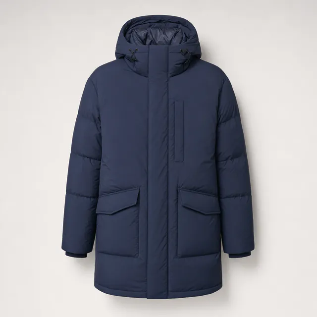
- The block at about 4225px is empty and sits after about 18 tiles. Visitors who viewed the Alpine Parka would see related parkas and bombers in stock instead of scrolling past Out of Stock items.
- Mesure
- Clicks on recommended tiles and product page views per session
Effet typique : +0,5–5 % de chiffre d’affaires par visiteur · typique de ce type de changement

 Aujourd’huiAvec Personyze
2Weather-led hero for cold and rainy days
Text and image personalizationWeather, Location- Qui
- Visitors where it is cold or raining
- Où
- Hero headline and the ‘Shop the collection’ button
- Pourquoi
- The hero line ‘Built for the long way round.’ and the category blurb ‘Shells and insulation for weather that changes its mind’ already speak to weather, but the page never reacts to it. The headline could name the local conditions and link straight to the Outerwear parkas and bombers.
- Mesure
- Hero button clicks and visits to Outerwear products
Effet typique : +15–20 % sur l’objectif de la page quand le test l’emporte · typique de ce type de changement

 Aujourd’huiAvec Personyze
3Welcome-back bar with sale pieces they viewed
Banners, bars and pop-upsVisit history, Viewed before- Qui
- Returning visitors who have not bought
- Où
- The top bar above the nav, replacing the generic shipping line
- Pourquoi
- The bar says ‘Free carbon-neutral shipping over $75 · 60-day returns · Repairs for life’ to everyone. Returning visitors could see a message about the sale items they viewed, such as Sherpa Bomber — Navy at $111.75 down from $149.
- Mesure
- Bar clicks and return-visit conversion to purchase
 Aujourd’huiAvec Personyze
4Ask what you need and narrow the catalog
AI Product FinderWhat they tell us, Device- Qui
- Phone visitors and first-time shoppers unsure where to start
- Pourquoi
- The ‘Everything in stock’ grid has about 20 tiles across 5 categories and 3 brands, and the phone page is about 18,000px tall. A finder lets people say ‘a warm jacket for rainy commutes’ and get a short list.
- Mesure
- Finder use, then product page views and add-to-bag from its results
5Free-shipping nudge for bag holders under $75
Banners, bars and pop-upsCart- Qui
- Visitors with items in the Bag worth less than $75
- Pourquoi
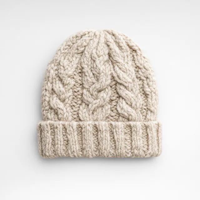
- The header Bag counter shows 0 and the offer ‘Free shipping over $75’ is a fixed line. Many tiles are below $75 (Merino Watch Cap $39, Everyday Canvas Backpack $39, Field Earbuds $59), so a shopper can be shown the gap and a matching add-on.
- Mesure
- Average order value and cart-to-checkout rate
Résultats typiques de ce type de changement dans des études et des benchmarks publiés — pas une prévision pour ce site.
Constats
- The ‘You might also like’ block (PICKED FOR YOU) sits at about 4225px, after roughly 18 product tiles and is currently an empty container with a note that it is waiting for a Product Recommendation campaign. Visitors get no personal picks.
- ‘Everything in stock’ lists about 20 tiles in one long grid. The phone page is about 18,000px tall, so a mobile shopper has to scroll a long way to find the item they want.
- The top-of-page value props (free shipping over $75, 60-day returns, repaired for life) are the same for every visitor, though a $39 backpack buyer and a $199 parka buyer are far from the $75 threshold in very different ways.
- The Field Notes articles (re-wax a jacket, coast path in the wrong month, why we stopped using virgin down) sit at about 4530px, after the product grid and below the fold, so they never help a shopper still deciding.
- Prices are mixed: 6+ tiles carry a SALE tag (for example Alpine Parka — Slate $141.75 from $189), but sale and full-price items are shown in one undifferentiated grid with no way to speak to deal seekers specifically.
- The only lead capture is the ‘Subscribe’ form at about 5535px (desktop) / 16939px (phone), near the bottom, with no earlier or smarter offer.
- Only the lcounter.personyze.com script is loaded and there is no sign of other tools, so cart, visit history and weather are all unused.
✓ Clear trust bar and the free shipping / 60-day returns / repairs for life strip directly under the hero
✓ Category filter tabs (All, Outerwear, Knitwear, Footwear, Bags, Audio) above the grid
✓ Size & fit guide link beside the collection
✓ Sale tags and out-of-stock labels are clear on tiles
✓ Short, honest Field Notes content with a repair and route angle
Audiences
| Connu par | Audience | Part | Pertinence aujourd’hui → avec les idées |
|---|---|---|---|
| Visit history | First-time visitors browsing the winter collection | 55% | 5 → 7 |
| Visit history | Returning visitors who left without buying | 25% | 4 → 8 |
| Viewed before | Visitors who looked at outerwear (parkas, bombers) | 35% | 6 → 8 |
| Viewed before | Visitors who looked at bags, footwear or audio | 25% | 4 → 7 |
| Weather | Visitors in cold or rainy weather | 40% | 5 → 8 |
| Device | Phone visitors facing a very long grid | 55% | 3 → 6 |
| Cart | Visitors with items in the Bag | 8% | 4 → 7 |
| What they tell us | Visitors unsure what to choose or who want a route or repair answer | 20% | 3 → 7 |
Toutes les fonctionnalités, confrontées au site
Très adapté5
Text and image personalizationThe hero headline and image are the same for everyone and could follow weather or category interest
Banners, bars and pop-upsThe top bar is fixed text, and a cart exit-intent message could carry the free shipping threshold
Product recommendationsThe ‘You might also like’ container is empty and waiting for a campaign
AI Product FinderThere are about 20 tiles across 5 categories and 3 brands, and phone visitors scroll a long way to find one
Content recommendationsField Notes articles sit below the grid at about 4530px and are not matched to interest
Possible8
Multi-Recommendation WidgetOne widget could hold tabs such as Trending, Recently viewed and Picked for you in the empty slot
AI PromotionsThe sale tiles could be promoted only to deal seekers instead of staying in the shared grid
CouponsThe Dispatch says ‘No discount spam’, so a coupon would suit only returning non-buyers
AI Content FinderField Notes covers repair and route questions that shoppers could ask directly
AI ChatFit, repair and sizing questions could be answered live next to the size & fit guide link
Show ReviewsTiles show only star scores, such as 3.9 (11), with no review text
Surveys and feedbackA one-question poll could ask what the visitor is shopping for
Web pushMade in single runs and ‘sent before they sell out’ suits restock alerts
Déjà sur le site2
Lead capture formsThe Subscribe form exists but only at the page bottom
Email and SMSThe monthly Dispatch email subscribe form is already on the page
Pas adapté3
Customer Logos and case studiesThis is a consumer shop with no business customers
Book a meetingNothing on the site calls for appointments
Show StoreThe pages show an online shop only, with no store locations
Pages lues
- Page d’accueilpersonyze.com/public/shop.htmlWaypoint & Co. — outerwear built for the long way round
Dans votre compte Personyze
Une analyse gratuite n’est qu’un début. Votre compte va plus loin.
Maintenant, votre propre site
Un plan comme celui-ci pour votre site, en 4 minutes environ. Gratuit, et aucun e-mail requis pour le voir.
Obtenir mon plan gratuitLes scores estiment à quel point vos pages parlent à chaque audience — ce ne sont pas des prévisions de ventes. Une maquette illustre l’idée, ce n’est pas une campagne créée.












Chaque visiteur, son propre site.
Créez les idées de votre plan en quelques minutes — avec le copilote IA, sur vos propres pages — et voyez qui chacune atteint.
Commencer gratuitement Réserver une démo
Gratuit pour commencer · sans carte bancaire · 4,8 sur G2