
Inspire me · Com’è fatto un piano
Waypoint & Co.Completato

 OggiCon Personyze

Idea 1 di 5 ·
Le 3 mosse principali
- 1
Tipico: +0,5–5% di ricavi per visitatore
- 2
Tipico: +15–20% sull’obiettivo della pagina
- 3
Le idee, disegnate su Waypoint & Co.
1Fill ‘You might also like’ with picks from what they viewed
Raccomandazioni di prodottoViewed before, Visit history
La sua immagine è all’inizio del piano
- Chi
- Returning visitors and anyone who has opened a product page
- Dove
- The empty ‘You might also like’ block, moved up to just under the hero or the category tiles
- Perché
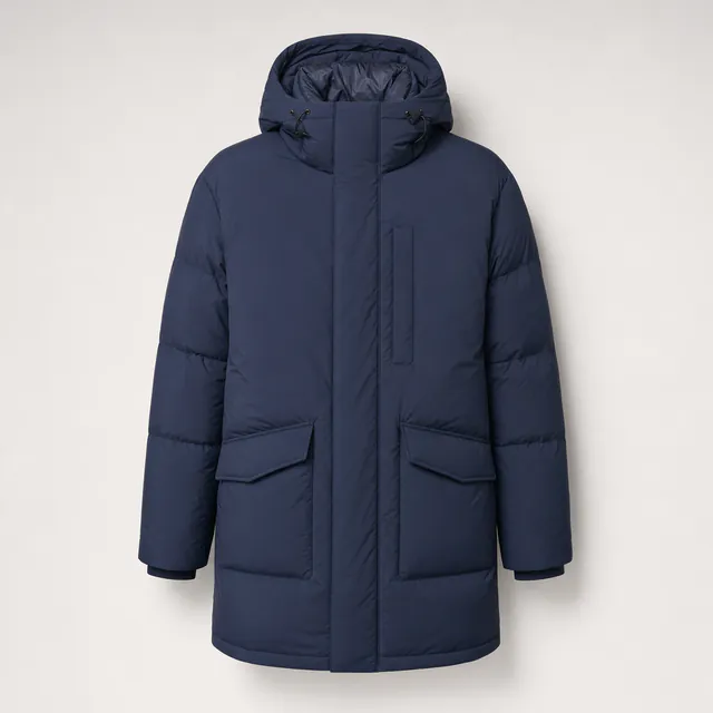
- The block at about 4225px is empty and sits after about 18 tiles. Visitors who viewed the Alpine Parka would see related parkas and bombers in stock instead of scrolling past Out of Stock items.
- Misura
- Clicks on recommended tiles and product page views per session
Effetto tipico: +0,5–5% di ricavi per visitatore · tipico per questo tipo di modifica
2Weather-led hero for cold and rainy days
Personalizzazione di testi e immaginiWeather, Location
- Chi
- Visitors where it is cold or raining
- Dove
- Hero headline and the ‘Shop the collection’ button
- Perché
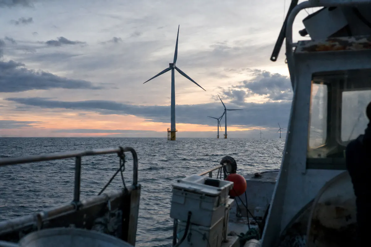
- The hero line ‘Built for the long way round.’ and the category blurb ‘Shells and insulation for weather that changes its mind’ already speak to weather, but the page never reacts to it. The headline could name the local conditions and link straight to the Outerwear parkas and bombers.
- Misura
- Hero button clicks and visits to Outerwear products
Effetto tipico: +15–20% sull’obiettivo della pagina quando il test vince · tipico per questo tipo di modifica

 OggiCon Personyze

3Welcome-back bar with sale pieces they viewed
Banner, barre e pop-upVisit history, Viewed before
- Chi
- Returning visitors who have not bought
- Dove
- The top bar above the nav, replacing the generic shipping line
- Perché
- The bar says ‘Free carbon-neutral shipping over $75 · 60-day returns · Repairs for life’ to everyone. Returning visitors could see a message about the sale items they viewed, such as Sherpa Bomber — Navy at $111.75 down from $149.
- Misura
- Bar clicks and return-visit conversion to purchase
 OggiCon Personyze

Altre idee
- 4
Ask what you need and narrow the catalog
Finder prodotti IA- Chi
- Phone visitors and first-time shoppers unsure where to start
- Dove
- Directly under the hero, above ‘Shop by category’
- Perché
- The ‘Everything in stock’ grid has about 20 tiles across 5 categories and 3 brands, and the phone page is about 18,000px tall. A finder lets people say ‘a warm jacket for rainy commutes’ and get a short list.
- 5
Free-shipping nudge for bag holders under $75
Banner, barre e pop-up- Chi
- Visitors with items in the Bag worth less than $75
- Dove
- Slide-in near the Bag icon and an exit-intent message
- Perché
- The header Bag counter shows 0 and the offer ‘Free shipping over $75’ is a fixed line. Many tiles are below $75 (Merino Watch Cap $39, Everyday Canvas Backpack $39, Field Earbuds $59), so a shopper can be shown the gap and a matching add-on.
Risultati tipici di questo tipo di modifica in studi e benchmark pubblicati — non una previsione per questo sito.
Osservazioni
- The ‘You might also like’ block (PICKED FOR YOU) sits at about 4225px, after roughly 18 product tiles and is currently an empty container with a note that it is waiting for a Product Recommendation campaign. Visitors get no personal picks.
- ‘Everything in stock’ lists about 20 tiles in one long grid. The phone page is about 18,000px tall, so a mobile shopper has to scroll a long way to find the item they want.
- The top-of-page value props (free shipping over $75, 60-day returns, repaired for life) are the same for every visitor, though a $39 backpack buyer and a $199 parka buyer are far from the $75 threshold in very different ways.
- The Field Notes articles (re-wax a jacket, coast path in the wrong month, why we stopped using virgin down) sit at about 4530px, after the product grid and below the fold, so they never help a shopper still deciding.
- Prices are mixed: 6+ tiles carry a SALE tag (for example Alpine Parka — Slate $141.75 from $189), but sale and full-price items are shown in one undifferentiated grid with no way to speak to deal seekers specifically.
- The only lead capture is the ‘Subscribe’ form at about 5535px (desktop) / 16939px (phone), near the bottom, with no earlier or smarter offer.
- Only the lcounter.personyze.com script is loaded and there is no sign of other tools, so cart, visit history and weather are all unused.
✓ Clear trust bar and the free shipping / 60-day returns / repairs for life strip directly under the hero
✓ Category filter tabs (All, Outerwear, Knitwear, Footwear, Bags, Audio) above the grid
✓ Size & fit guide link beside the collection
✓ Sale tags and out-of-stock labels are clear on tiles
✓ Short, honest Field Notes content with a repair and route angle
Pubblici
| Noto da | Pubblico | Quota | Pertinenza oggi → con le idee |
|---|---|---|---|
| Visit history | First-time visitors browsing the winter collection | 55% | 5 → 7 |
| Visit history | Returning visitors who left without buying | 25% | 4 → 8 |
| Viewed before | Visitors who looked at outerwear (parkas, bombers) | 35% | 6 → 8 |
| Viewed before | Visitors who looked at bags, footwear or audio | 25% | 4 → 7 |
| Weather | Visitors in cold or rainy weather | 40% | 5 → 8 |
| Device | Phone visitors facing a very long grid | 55% | 3 → 6 |
| Cart | Visitors with items in the Bag | 8% | 4 → 7 |
| What they tell us | Visitors unsure what to choose or who want a route or repair answer | 20% | 3 → 7 |
Tutte le funzionalità, verificate sul sito
Molto adatto5
Personalizzazione di testi e immaginiThe hero headline and image are the same for everyone and could follow weather or category interest
Banner, barre e pop-upThe top bar is fixed text, and a cart exit-intent message could carry the free shipping threshold
Raccomandazioni di prodottoThe ‘You might also like’ container is empty and waiting for a campaign
Finder prodotti IAThere are about 20 tiles across 5 categories and 3 brands, and phone visitors scroll a long way to find one
Raccomandazioni di contenutiField Notes articles sit below the grid at about 4530px and are not matched to interest
Possibile8
Widget multi-raccomandazioneOne widget could hold tabs such as Trending, Recently viewed and Picked for you in the empty slot
Promozioni IAThe sale tiles could be promoted only to deal seekers instead of staying in the shared grid
CouponThe Dispatch says ‘No discount spam’, so a coupon would suit only returning non-buyers
Finder contenuti IAField Notes covers repair and route questions that shoppers could ask directly
Chat IAFit, repair and sizing questions could be answered live next to the size & fit guide link
Mostra recensioniTiles show only star scores, such as 3.9 (11), with no review text
Sondaggi e feedbackA one-question poll could ask what the visitor is shopping for
Web pushMade in single runs and ‘sent before they sell out’ suits restock alerts
Già sul sito2
Moduli di acquisizione leadThe Subscribe form exists but only at the page bottom
Email e SMSThe monthly Dispatch email subscribe form is already on the page
Non adatto3
Loghi dei clienti e casi di studioThis is a consumer shop with no business customers
Prenota una riunioneNothing on the site calls for appointments
Mostra negozioThe pages show an online shop only, with no store locations
Pagine lette
- Home pagepersonyze.com/public/shop.htmlWaypoint & Co. — outerwear built for the long way round
Nel tuo account Personyze
Un’analisi gratuita è l’inizio. Il tuo account va più a fondo.
Ora il tuo sito web
Un piano come questo per il tuo sito, in circa 4 minuti. Gratis, e senza email per vederlo.
Ricevi il mio piano gratuitoI punteggi stimano quanto bene le tue pagine parlano a ciascun pubblico — non sono una previsione delle vendite. Un mockup illustra l’idea, non è una campagna realizzata.









Ogni visitatore, il suo sito.
Realizza le idee del tuo piano in pochi minuti — con il copilota IA, sulle tue pagine, e guarda chi raggiunge ciascuna.
Inizia gratis Prenota una demo
Gratis per iniziare · senza carta di credito · 4,8 su G2